Introduction
The Design Hub (TDH) is an interior and architecture firm specializing in renovations and design. However, outdated visuals failed to reflect its expertise and values. The goal was to create a fresh, modern identity that communicates the firm's creativity, balance, and professionalism.
Strategy
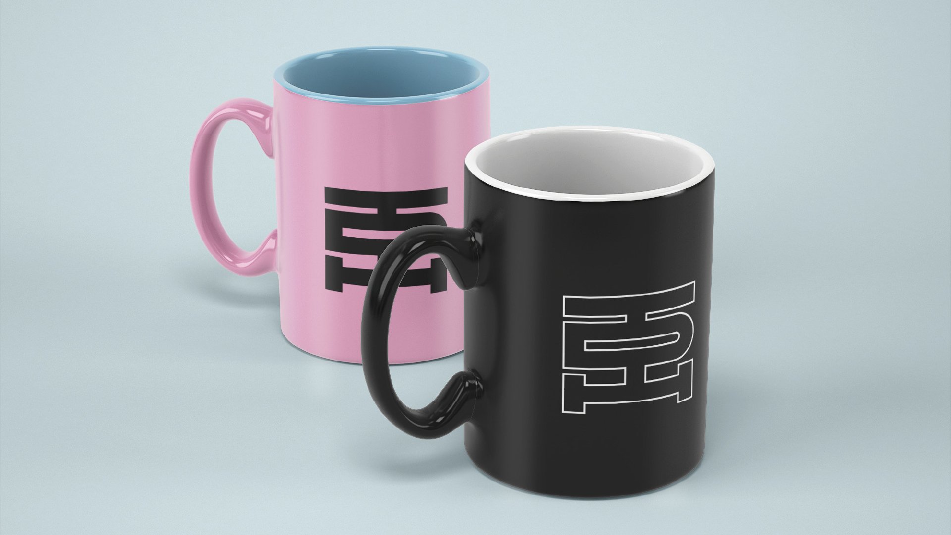
The rebranding centered on a new logo that merges the letters T, D, and H into a seamless, masterplan-inspired design, symbolizing the fusion of architecture and interior expertise. A thoughtful color palette was developed, with each color representing a brand value—pink for edginess, blue for comfort, and others reflecting creativity and balance.
Design
The identity features a sleek, systematic grid system inspired by architectural layouts, providing structure and versatility. The bold, balanced logo pairs with a cohesive color palette to convey strength and modernity. Every element reflects TDH’s commitment to innovation and precision.
Results
The rebranding transformed TDH into a visually compelling and professional brand. The strong, balanced identity now resonates with clients, effectively representing the firm’s expertise and values.